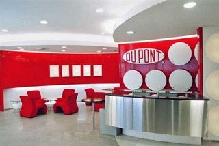
Architect of Dupont office in Gurgoan, Sonali Bhagwati, used company products like Corian, paints and PVB films to create innovative designs and branding.
When you enter the Dupont office in Gurgoan, the first thing that you would notice at the reception is the illuminated portraits of its founders. You would be wondering – what sort of material is it created of? It looks a bit like plastic yet it has luminous quality. It can be moulded, twisted and turned, and even fused! Think no more. It’s Corian, a direct usage product from Dupont. The portraits are actually carved out of Corian and lit from the back.
Creative challenges
When architect Sonali Bhagwati and her team at Spazzio were commissioned to design Dupont’s office in Gurgoan, they decided to use other products of the science and research company to create innovative designs and branding.
“The client suggested that their material could be used to highlight their work. And as an architect it was a great opportunity,” says Bhagwati, who is a partner at New Delhi based-Spazzio Design.

Explaining the reason for using Corian, she says, “It is an expensive product, so it has limited usage. Generally it’s used on counters like kitchen. However when we decided to use the product, we wanted to showcase the versatility of the material.”
Corian is very flexible and fluid in terms of what it can do. Bhagwati decided to adopt an extremely fluid plastic form which is ideally suited for this sort of a product. She realized that when corian is used in a thin sheet, it has a luminous quality. She decided to highlight this particular feature through the designs.
The second material used was paints by Dupont. “They make high grade automotive paint. We used those again as a part of the central plastic form that we developed. It was almost like a scriptural form,” she claims. While some of the surfaces in the office were with corian, rest were with paint.
The third product used in designing was PVB films by Dupont. PVB film is used to stick glasses together to give them extra strength. And incase the glass breaks, the film doesn’t allow it to fall. The architect used the film to work out a detail where the glass partition does not go up to the ceiling instead it turns. “It is a very unusual detail which we found possible mainly because we used this sort of film,” feels Bhagwati.
Central theme
Her team created circle as a central design element as it is the most stable of all geometrical forms. “We decided to take circle as an element and build it as the design language through out the entire office. We cut circle out of corian and lighted it from behind. The corian looked as a large glowing circular form,” explains Bhagwati. The circular form is consistent throughout the office – right from the reception wall to the ceilings. The work cabins have circular netted partitions. Glass tables at the sitting areas are also circular in shaper supported by stainless steel rods. Cavity lights used have added to the circular feel.
Branding through design
Apart from using corian and film in design, the architect also used them for branding purposes. “We built up branding possibility as a part of our design where we created specialised branding areas highlighted through carved corian,” she says. The portraits of the founders at the reception are one of them. The same technique was used in running places, which are back light, to highlight the Dupont’s philosophy, policy and story. Films were also used at the reception for branding. “Basically we used all the products in every possible way to built of them into design element and create a form,” explains Bhagwati.

Space and colours
The architect stuck to the corporate colour themes of Dupont i.e. red and white. [apart from these two, the other visible hues are stainless steel and natural timber]. Bhagwati claims that the ‘office screams Dupont’!
In terms of office spacing, the architect kept in mind the client’s requirement while following system of corporate plan like keeping mind the separation of common areas from key access areas and protected area.
Cafeteria and washrooms
Designs in the washroom and cafeteria are an extension of the office space yet have a distinct feel apart. In the washroom, the architect continues to use circular forms in the wash basin. Yet what makes it different is the use of light. A natural timber has been used as the base to the corian wash basins. The water taps are made out of stainless steel.
Bhagwati gives a completely different look to the cafeteria. Usage of different coloured chairs, tables and
wall is a welcome relief for the employee after a hard day work. The use of square and rectangular motifs on the wall in red, orange and yellow colours breaks the monotony of the circular theme.
Dupont Gurgoan office stands out as a perfect example of product innovation and a blend of design and branding.
Mind behind it
Sonali Bhagwati is a partner at New Delhi-based design and architect firm Spazzio and an architect for 20 years. She is an executive member, Conservation Society, Delhi and is involved in making audiovisual programs of historical areas in the urban milieu.
Her firm is engaged in designing office spaces, buildings for IT firms and hotels. Some of the recent projects include the Adobe offices in Noida and Bangalore, Tata Consultancy Services office in Gurgaon and the new Taj hotel in Bangalore.
—
(c) Published in CW Interiors, September 2008
